
Once you walk in the main entrance, the architecture is very appealing. The decor is very modern. The colors, style and textures reflect an upscale atmosphere. At this point I started to assess the signage and displays. Note the free-standing portable sign at the bottom center of the photo. These types of sign systems can be found throughout the mall. Although they are effective in that they can be moved to different locations and that the cardboard inserts can easily be swapped out, they are of lower quality and seem out of place.

In chapter 7 of Information Design, Screven suggests that planning and designing of signage for areas like malls are meant to "...affect people's actions, attitudes, preconceptions, and/or comprehension. Their purpose is to encourage self-directed people to focus on and retain messages in which they may or may not be interested initially." (Jacobson, 134-135). It was with this in mind that I began to navigate the environment with no specific purpose except to absorb the information I saw as I made my way through the building.
I found my way to a kiosk that had a map of the mall inside a rear-lit lightbox display. I was glad to see the map was color-coded and the legend was easy to follow, but the background graphic/photography seemed very distracting and un-necessary.

I wandered the mall perimeter taking notice of how the store signage was mostly difficult to see until you faced the store you wanted to go to head on. Some of the methods of sign display were the use of cut out 3D letters, rear-lit graphics, or simple vinyl lettering applied to a wall or surface. Notice the Sears sign in the photograph below is no longer illuminated... making me wonder if the sign is simply "out" or if Sears is no longer an anchor store in this building?

In contrast to the information presented in the Jacobson text regarding sign-posting, most signs above the store entrances seemed to be displayed with creativity and consideration for the surrounding architecture. There appeared to be no conflict between what the architect had planned and what the designers intended for the space usage as discussed by Passini on page 95 of Information Design "Architects often see signage as a necessary evil... Graphic designers complain that they are not involved in the design of wayfinding support". In this economy where stores seem to come and go from these types of malls on a month to month basis, it is no wonder that the allotted spots designated for each company's logo or brand trade-mark are similar from store to store.
On a few occasions I found some signs that stuck out from the sides of the stores. I made note of this display method to be sure to point out how effective I thought it was. Even though the signs weren't back-lit or even made to look 3D, they seemed to be easier to notice and made it a lot more convenient to look down a long hallway and see a sign like this promoting a store entrance or a sale of some sorts. It reminded me of the airport signage from the Bureau Mijksenaar case study in our Information Design Workbook (Baer, 206).
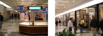 Notice how the Banana Republic, Buckle, Rite Aid and even the Kiosk signs stick out
One store in particular caught my attention as I made my way through the sprawling complex. The Justice store which caters to young pre-teen girls was easily the most eye-catching and audience appropriate design that I came across. The choice of colors, typography, graphics and product placement was perfect for the intended customer. Even the music playing as you walked by made it clear that the store targeted a younger generation.

Other stores had typical window displays that showcased the latest in spring-time fashion, or the hottest new gadgets or sale items. These are effective strategies businesses use to to get customers to come into their stores. Many times the product will be on display along with some form of signage or visual element (not always a price or percentage of savings), but sometimes a clever tag line or thought-provoking comment is used that makes people believe they need the product... or that they shouldn't pass up such a good deal. Such verbiage as "Act Now", "iPad2 is HERE!", and "Limited Time Offer" is meant to engage the customer before they even enter the store... or better yet, stop them from walking away and passing up a bargain or two.
A rather disappointing find was when I reached the food court area, I noticed a series of columns positioned in such a way that it made it difficult to read the names of the food vendors without making your way through the crowds waiting in line to buy their meals. Even though the food court area was large enough to accommodate many shoppers, the design of the overall space seemed neglected and that the signage was an after-thought.

A few other areas also seemed to suffer from a lack of proper signage and/or displays.

What is down this corridor? - Note the banner on the partial wall.
Overall, the mall had a variety of high-quality and well-thought-out design strategies. Some of the neglected areas of the mall contained less than ideal displays and signage, but I attribute that to the "low-rent" / "low-traffic" areas. A few of the more trendy logos on the store entrances could stand to be treated in a different manner so that they are easier to read, or stand out a bit more. Sometimes the cut-out effects or the thin 3D letters were difficult to read unless you stand directly in front of a store entrance. Other stores may only have an icon or a symbol (i.e. Apple store) in which case customers need to be aware of the company brand or at the very least the product the store sells. Kudos to the stores that started to utilize the old village shop hanging sign approach... which definitely made it easier to see a store from farther away.
When I finished up my research I asked my friend who I went with if she had any complaints about the mall. Her comments were mostly of the nature of being dis-satisfied with the parking and lack of signage on the outside of the mall to direct customers to an entrance closer to the shop(s) they wish to visit. I think an effective study to better understand how to improve the overall shopping experience would be to interview customers at various locations throughout the building. Possibly as they enter or leave through a main entrance, or in the food court area. Audience feedback would be a great starting point for future improvements.Works Cited:
Baer, Kim, and Vacarra, Jill (CON). Information Design Workbook: Graphic Approaches, Solutions, and Inspiration + 30 Case Studies. Rockport Pub, 2010. Print.
Jacobson, Robert Information Design The Massachusetts Institute of Technology, 1999. Print.
I really liked your blog. I too picked a mall but I like the layout of your mall much better. I see that both our malls have problems with the signage outside of the mall and with parking. Do you think all malls have these same issues?
ReplyDeleteExcellent job. I like your description of each photo and the analysis as well. Most malls lack good quality signage somehow unfortunately. Malls are needed of good information designers. I never liked going to malls, it took me forever to find what I wanted and or my way out of there. I enjoyed your post.
ReplyDeleteBest,
Victor
Paul,
ReplyDeleteI really like your assessment of Eastview Mall. What you have noted is true even though I never stoped to think about these things until you brought them up. I have been to Eastview multiple times and I just grumble about the parking directions and other points but never stoped to evaluate it until now. Thank you, very enlightening. Great Work!
Sharon